Wednesday, August 31, 2011

If Dinnerware Could Dance!

The dishes were a gift from a neighbor who was downsizing and moving to Florida. They've been wrapped in newsprint and packed away in a tote for months. I've struggled to decide how I could use them in a tablescape post. Mid-century modern isn't my favorite design period. There, I've said it, and I know it makes me hopelessly uncool. But it was more than that; the pattern's design says one thing, while the muted tones and brown leaves say another. Colorful flower arrangements seemed too bright. Dried flowers and leaves seemed not summery enough. Another issue for me is that most of the stemware and flatware in my "arsenal" is too formal.

Then I found some sturdy, handsome (I think) brown glassware at Goodwill (99 cents per stem!). Things began to fall in place, and the table below is the result.

I used clear glass single candleholders and pressed glass tealight holders. I can't give up sparkle entirely, and I didn't want the silverplated flatware to be the only shiny thing on the table. The taper candles are by Colonial Candles. Where else do you turn when you need to match the color of the sliced cantaloupe on your dinnerware?


The “Tampico” pattern was part of the “Futura” line of dinnerware introduced by the Red Wing company in the mid-1950s. The pattern was designed by Charles Murphy and won top prize at the National China, Pottery and Glass show in 1956.

The original advertising blurb for Tampico [as shown in Ray Reiss’ identification guide to Red Wing Dinnerware] says it creates a fiesta-like atmosphere and is perfect “whether you’re serving burgers backyard style or snacking on TV trays. A great conversation starter for today’s garden party!"

The Futura Tampico pattern was also advertised as the “new south of the border look” in dinnerware. Like all Red Wing dinnerware, Tampico is oven proof, hand painted, and sealed by the glaze to keep each piece color fast.


Red Wing Pottery had its origins in the rich clay found in Red Wing, Minnesota, in the early 1860's. The company would make its official debut in 1877 as the Red Wing Stoneware Company. Over the next 90 years, the company would have six incarnations with the last being named Red Wing Potteries.

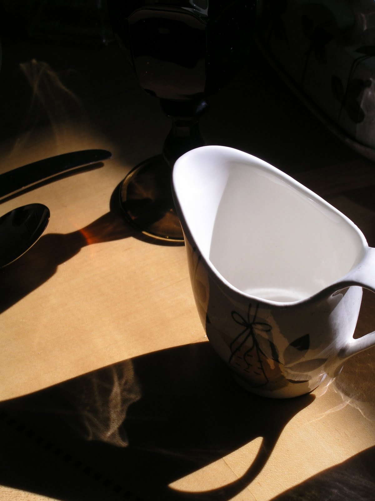
The flatware is "Leilani" by 1847 Rogers Brothers. The pattern was produced from 1961-68.


A brochure states that "It's fiesta time every time you dine on this exciting new Red Wing dinnerware, hand-painted in rich browns, greens and vivacious melon accents, lightly flecked with brown overall. Tampico - a pattern to pep up the 3-times-a-day routine - to make all your entertaining colorful and different." It goes on to say that Tampico pattern dinnerware is "the life of the party! If dinnerware could dance, Tampico would surely outstep them all! Set your table with this vivacious dinnerware, and suddenly it's a party!"

The stemware is "Arlington" (circa 1978) by Viking Glass. What began in 1900 as New Martinsville Glass Manufacturing Company became The Viking Glass Company in 1944. Located in New Martinsville, West Virginia, these two companies were producers of elegant and colorful decorative glass pieces. The company went out of business in 1999. Due to the popularity of their glassware and high sales volumes, much of Viking's output remains available today in stores that sell vintage and antique items (at reasonable prices).


Red Wing Potteries introduced their Futura line of dinnerware in 1955 with excitingly modern shapes. Designed by Charles Murphy, the flatware pieces in the line are slightly ovoid rather than round, and the serving pieces are slightly off-center. A Red Wing brochure states of the Futura line that "Red Wing's new shape is modified oval, designed for practicality as well as interest and grace. Plates, bowls and cups are easy to handle, easy to stack, and require minimum table space - ideal for outdoor and buffet service."


With fruit and wine bottles in the dinnerware's motif, I thought clusters of grapes might be enough to provide an appropriate centerpiece. Then, I thought I'd insert a few Black-eyed Susans from the garden for additional color. On closer examination, the blooms weren't "centerpiece ready." I found a mixed bouquet at Kroger reduced from $15 to $2.99. VoilĂ !


I poured water in the vegetable bowl before adding the grapes and used the fruit to hold the flower and greenery stems in place. I cut the stems at an angle and inserted them carefully to avoid piercing the skins of the grapes.


My favorite time of day for photography is late afternoon, when shadows create interesting effects.


And then, of course, it's time to light candles ....


Charles Murphy
(1909 - 1994)
Born in Ohio, the Pottery Mecca of the United States, Charles Murphy was destined for a career in ceramics. When Charles was a child, his father was employed by Saxon Potteries, who also gave the young lad his first job during summers when he was away from school. Young Charles went on to study fine art at the Cleveland Art Institute, working in his spare time at Guy Cowan's pottery studio. His talent gained him a scholarship to study art in Europe, but after his return to the United States during the throes of the Great Depression Murphy was forced to re-enter the field of pottery. During this time he worked alongside such greats in the field as Frederick Rhead of the Homer Laughlin Company. In 1940, Murphy began work for Red Wing Potteries where he remained until the late 1950's, with the exception of a short stint in the military. Later in life, Murphy returned to the fine arts working primarily as a wildlife painter.


Red Wing Dinnerware lines had glazes applied by hand via an assembly line structure. In the photo below, women using artists' brushes applied individual strokes to light stencil markings on a piece of dinnerware. The piece was then sent down the line to the next decorator who would apply a different stroke. The more strokes a pattern had the higher Red Wing’s production costs.

Tampico was Red Wing's most complicated pattern. It required more brush strokes (150+) than any other.


A selection of relevant promotional materials from the past:


Tampico is a city in the Mexican state of Tamaulipas.
Popular culture:

Joseph Hergesheimer's 1920s novel Tampico tells a tale of expatriates living in the city.

"Tampico" is the title of a 1945 song composed by US artist Gene Roland and produced by jazz musician and conductor Stan Kenton, with lead vocals by June Christy. Roland suggested in his song that the city had become more American than America itself.

Director John Huston set the opening scenes of his motion picture epic, The Treasure of the Sierra Madre in Tampico.

Jimmy Buffett wrote the song "Tampico Trauma" about experiences in the city.

Episode 33 of the television series Maverick is set in the city and titled "Escape to Tampico."

The novel "Tampico's Gold" by Elizabeth Braun describes Tampico in poetic detail.

Tampico is a popular orange-flavored beverage based in the United States.


"Tampico" by Gene Roland and produced by Stan Kenton. The song gave June Christy a top-ten hit in 1945, peaking at #6 on the Billboard charts. Christy later commented to the Jazz Journal International that she had been disappointed that her first recording with Kenton was Tampico, but was fortunate that it was a hit and established her right away.

Guaranteed to have you humming along -- enjoy!


I hope you enjoyed your visit. Please stop by Susan's Between Naps on the Porch for the inspiring tables of Tablescape Thursday!


Monday, August 22, 2011

The Real Tables of Affordable Accoutrements!

Often readers will ask if the tables they see on Affordable Accoutrements are used for "real world" entertaining. Sometimes the answer is yes. On those occasions, the table settings are often scaled back considerably by the time guests arrive.

The table below was set quickly, using dishes, glassware, and flatware that are all automatic dishwasher-friendly. I was serving a simple lunch for friends before heading out to a matinee showing of "The Help" (loved the film by the way!). I hadn't intended this to become a tablescape post, but thought, "Why not?"


The dishes are Charter Club's "Country Chateau." They were made for Federated Department Stores in the 1990s. These were a Goodwill find.


The stemware is Rock Sharpe, and the stem shape is 3005. The company produced these in the 1930s and 40s in a variety of cut and etched patterns. You can read more about them
HERE. I collect them according to shape (and ignore the pattern). I think mixing the patterns, while keeping the shapes consistent, adds interest to the table setting. The floral napkins are an easy-care blend, and the napkin rings are stainless.

The flatware is "American Harmony" stainless made by Oneida. The washable cotton placemats came from a local estate sale.


The lead crystal salad bowl is from Belk. The oil and vinegar cruets were purchased at Ross, and the stainless caddy with glass inserts is from Goodwill. The salad serving set was a consignment shop find.


The light vinegrette dressing is store bought. Serving it in a vintage Duncan & Miller "Canterbury" (1939-55) creamer provides a considerably nicer presentation than passing the bottle around the table! The creamer's glitzy coaster (from Goodwill) is intended for use with a pillar candle.


The roses are from Kroger. They're currently only $7.77 per dozen, and I love the color! Unlike many supermarket roses, these have a sweet, subtle fragrance. I arranged them very simply in lead crystal vases from Goodwill.


Having two vases rather than one allows the individual bouquets to be moved to the ends of the table when the meal begins. Each place setting has a single rose in a Rock Sharpe juice glass. I re-cut the stems under water and moved them quickly to the containers (to which flower fresh had been added).


As so often happens, the flowers continued to open and were far more lush and beautiful later in the day after guests had gone.


So ... no late afternoon sun streaming across a table set for eight. No photos by candlelight (and no candles since it was a luncheon).


I thought of taking a picture of the post-meal kitchen "carnage" after we had dashed off to see "The Help," leaving clean-up for later. But it wasn't a pretty sight, and I prefer showing you (what I think are) pretty things.


If you're wondering, the salad began with bagged romaine and veggie mix. I added baby spinach, low-fat shredded mozzarella, locally-grown tomatoes, and English walnuts. The main course was shrimp, red onions, and thinly sliced lemons sauteed in butter and olive oil, served over rice (seasoned with black pepper and a dash of hot sauce) -- no recipe; I made it up as I went along.


The round loaf of artisan bread came from the Kroger bakery. I heated it in the oven, until the crust was nicely browned, and served it with olive oil and freshly ground pepper for dipping.


Dessert was super-easy: caramel praline ice cream served in Rock Sharpe sherbets, drizzled with coffee liqueur and topped with chopped pecans. Cookies from the Kroger bakery tasted almost homemade after heating for a few moments in the toaster oven.


To achieve the look of single roses in small glasses, stem length is important. Too long, and they tilt to one side or the other. If cut too short, they don't have the support they need. Normally I cut flower stems at an angle. Cutting these straight across helped prevent them from leaning. Naturally, a larger flower works best.


My inspiration for the roses came from the cover of William Yeoward's "On Entertaining." I wasn't familiar with the work of the immensely talented Mr. Yeoward until he was mentioned in a very kind comment I received from Jane and Lance Hattatt.


Jane and Lance blog about their "two lives embracing the eclectic, the eccentric, and the esoteric." I urge you to visit HATTATT at your earliest opportunity. Every post is witty, stylish, informative and fun! Click the cover photo below to see the Amazon listing for the book -- truly an amazing, inspiring volume available at unbelievably low prices!


Please join Susan of Between Naps on the Porch every single week for Tablescape Thursdays.


Tuesday, August 16, 2011

A Tropical Table and a Tribute

When the table seats eight, and it's dinner for seven, how does one avoid creating a visual void?

One solution might be to let the centerpiece become an "end piece." That's what I've done today. Well, naturally, I continued the design down the center of the table, but the emphasis is on the tall floral arrangement at the end.


I wanted to create a relaxed, tropical mood in the sunroom.


I tend not to create themed tables. I'm more inclined to mix a variety of vintage and modern pieces with the goal of creating an atmosphere or a feeling.


Plates with fish designs were used by the Greeks as far back as the 4th century BC. There's a long history of French Limoges plates featuring fish designs. Whenever I see them in antiques shops or at estate sales, they're always very expensive.


My Williams-Sonoma "La Mer" dinner plates (from Goodwill!) feature a variety of fish designs, taken from original watercolor paintings by Parisian artist Marc Lacaze.


"South Seas" by Oneida (1955-65), one of my favorite vintage silverplate patterns, seems to me to be an appropriate dinner companion for the plates.


I wanted to keep the setting unfussy, so I left the table bare and added a bit of "lift" to the plates by placing them atop plain, rather chunky, dinner plates from Pottery Barn.


I'm using beautiful tapers by Colonial Candles in a soft, buttery yellow. I thought they might look nice in turquoise candleholders (of which I had none). I improvised by filling small glasses, probably intended for serving whiskey, with tinted water. Then I partially submerged clear glass candleholders in the water. Their flared rims held them in place.


The glasses were free at the end of a local estate sale. I was looking at them on an outside table, and the man said, "You can have them. Otherwise they're going in the trash." The candleholders, which I use frequently for tealights, were thrifted. I left the sticker on the candles to remind readers to check out the Colonial Candles website HERE.


The glassware is vintage. The heavy, pressed glass stems I'm using for water were labeled Fostoria in a booth at a local antiques mall, where all the items are $3 each. I'm not sure if they're actually Fostoria, but they do have three seams (mold marks). Glasses that have only two are usually lesser imitations.


The tall wheel-cut stems came from a recent estate sale. At first I thought they were too fancy for today's table, but then I focused on the fern and flower design and decided they had an island feel. Mainly I just like the stems, the shape, and the sparkle they provide!


I'm using glads again. When the colors are this gorgeous, and the prices are so reasonable, they're difficult to resist. At only 99 cents per bundle, I splurged and bought three in assorted colors!


I love the ruffled edges of the blooms.


The three small bouquets are in vintage Japanese jars. Their ceramic stoppers have a layer of cork to help them seal, so I assume they were originally used for serving sake. I saw them at a local antiques mall (3 for $4!) and thought, "Vases."


To move the bright orange color down the length of the table, I added blooms from the "Bengal Tiger" canna lilies in the garden.


The "end piece" container was a Goodwill find. I lined the vase and the votive holders with "Bengal Tiger" canna leaves. Rather than cutting them perfectly to size, I let them be "expressive." Was it the correct choice? I don't know -- I tend to go with what feels right.


I added water to the candleholders and floated tealights in them. The water lifted the little candles and helped protect the leafy liners.


Late afternoon shadows ...


Candle time!


The blue hour ...


Perhaps I could serve salad on the fish plates and fish on the dinner plates below?

From Wikipedia regarding Graeco-Roman fish plates: "Some contend that fish plates were decorated with pictures of the seafood they were intended to hold. Most of them, however, have been found in mortuary contexts, so it might be surmised that the fish images could represent symbolic offerings for the dead."


Do you like the idea of using a tall centerpiece at the end of the table?


Canna blooms usually don't do well as cut flowers, but, if they're just opening, they can make it through at least one evening.


I think Marc Lacaze's designs are beautiful. From his blog:


"His work is a fascinating documentary of his travels, inspired by the sensory exploration of these places, in the Romantic tradition.

His work has been published by a variety of international magazines and book publishers. In the U.S, his work appeared in Travel & Leisure Magazine consistently for 7 years. Other magazines include Le monde, Geo, Food & Wine, Town & Country, and Regal... His has worked with publishers Gallimard, and le Cherche midi. Business clients include le Club Med, Frequence plus, Hennessy, Accor, and BNP...

For several years, Lacaze has worked on exclusive collection pieces for Williams-Sonoma, one of America’s largest consumer retail companies for tabletop and housewares."


As I was working on this post, I was saddened to learn that Marc Lacaze died unexpectely on August 9, 2011, and his funeral was today in Paris.
HERE's a post about it at Journey Jottings.


A short video from an interview in 2010:


Williams Sonoma - 'Marc Lacaze' from 3C Films on Vimeo.


Let's drink a toast to a talented artist, who did beautiful work and brought the world happiness and inspiration.


Please join Susan of
Between Naps on the Porch for Tablescape Thursday.